
Today, we’re going to talk about healthcare. No, not the ACA (Affordable Care Act, AKA Obamacare) or the AHCA (American Health Care Act, AKA Trump Care and/or Ryan Care). I’m not that silly. No matter what I say about those plans, it’s guaranteed to upset half our readers, not to mention half the country. No, what I want to talk about today is the cost/benefit relationship of what the United States pays for healthcare VS what it receives for that expenditure. That’s something we can talk about without having to confront all the emotional baggage tied to any discussion about specific plans. It is a discussion, however, that should inform any position we take regarding the future of healthcare in the United States–and anywhere else in the world, for that matter.
A good place to start would be two new articles in The Lancet which address the current and future economics of global healthcare.
Evolution and patterns of global health financing 1995–2014
The first article is an analysis of global financing trends across two decades of data by the Global Burden of Disease Health Financing Collaborator Network.1 Dieleman, Joseph et al. “Evolution and patterns of global health financing 1995–2014: development assistance for health, and government, prepaid private, and out-of-pocket health spending in 184 countries.” The Lancet, 19 April 2017. http://www.thelancet.com/journals/lancet/article/PIIS0140-6736(17)30874-7/fulltext The study found, not surprisingly, that economic development was positively associated with total health spending and that the largest absolute increase in spending was in high-income countries–although the rate of increase was similar across all countries at about 5% a year. The polyp in the colon, as we will discuss in a moment, is that in absolute terms a 5% increase applied to a small amount is a whole lot less than 5% applied to a large amount.
 The bottom line takeaway is that health spending throughout the world remains unequal, with low-income and lower-middle-income countries spending the least on healthcare and increasing spending (in absolute terms) the least and relying heavily on development assistance and out-of-pocket spending by individual patients (more on this later) to make up the difference. Moreover, tremendous variation shows that neither time nor economic development guarantees adequate prepaid health resources, which are vital for the pursuit of universal health coverage. In many low-income countries, per capita spending on healthcare remains less than $100 per year, not to mention the fact that inadequate resources prevent people from accessing quality healthcare. By contrast, in many high-income countries, annual health spending has ballooned to higher than $5000 per person. In the US, we’re talking about an astonishing, world leading, $9237 per capita in 2014. To summarize, in 2014, spending per capita in low-income countries varied from US $33 to $347, and per capita spending in high-income countries varied from $853 to $9237. These realities are reflected in public policy where we see calls to rein in health spending growth in high-income countries (think AHCA, the proposed Republican plan) and appeals to mobilize more resources for health in low-income and middle-income countries. The upshot, though, is that in absolute terms, the reverse holds true for poorer countries. Low-income and lower-middle-income countries are increasing their health spending at much slower rates than more economically developed countries. In other words, the health expenditure gap between the haves and have nots is ever widening.
Think of it this way. If a poor country, which currently spends $200 a year per person on healthcare, increases its spending by 5%, that represents an increase of only $10 per capita in the following year. In the United States, by comparison, that same 5% increase represents an additional $462 per capita, or 46 times as much. As a reference point, Somalia, the low man on the totem pole, spent a mere $33 per capita in 2014. A 5% increase for Somalia, if the numbers hold true, would only mean an additional 25 cents per capita in the subsequent year. And keep in mind, that $33 doesn’t get distributed evenly across the country. The wealthy will get most of that coverage; the poor get less, if not zero, in health spending. The reality is that the poorest people are likely to go untreated. To appropriate a word from President Trump, “Sad!”

Even sadder, though, is that when citizens of a country don’t have insurance, they are forced to pay out of pocket as we mentioned earlier. And when people pay out of pocket, the poorest people are doubly screwed.
- Either they forgo treatment.
- Or they pay for the treatment with money they don’t have, which throws them into poverty because they can’t afford the costs.
From what we’ve said so far, you would think this would be a problem exclusively for the poor countries on the list. Unfortunately, the U.S. has the same problem because it doesn’t have universal coverage for its citizens. The ACA (Obamacare) attempted to remedy that by providing insurance to the previously uninsurable so as to prevent families that suffered catastrophic medical expenditures from being thrown into poverty. And while it did provide insurance for millions of people who were previously uninsured, it still left as many as 30 million uncovered. That said, the AHCA (the proposed Republican healthcare plan), at least in its current form, will likely end up reversing most of those gains.
Future and potential spending on health 2015–40
The second article, put together by the same group, represents estimated future and potential health spending for the same countries over the next quarter century, and the projection, as might be expected, is grim except for upper-middle-income countries.2 Dieleman, Joseph L et al. “Future and potential spending on health 2015–40: development assistance for health, and government, prepaid private, and out-of-pocket health spending in 184 countries.” The Lancet, 19 April 2017. http://www.thelancet.com/journals/lancet/article/PIIS0140-6736(17)30873-5/fulltext It is especially grim for low income countries because they are expected to still be astoundingly low in absolute terms in how much they spend on health per capita. But it will also be grim for the countries that already spend the most on healthcare, as their health spending growth will be punishingly high in absolute terms. Specifically, high-income countries, which spent $5221 per capita on average in 2014, are expected to increase spending by $3994 between 2014 and 2040, and upper-middle-income countries, which spent $914 in 2014, are expected to increase per capita spending by $2989 (1856–4827). Meanwhile, lower-middle-income countries, which spent $267 per capita in 2014, are expected to increase spending by just $577, and low-income countries, which spent $120 in 2014 are expected to increase spending by a mere $75.
Oh, and if current trends continue in the US, you’re looking at over $16,000 per capita by 2040–an amount that is simply unsupportable.
Does Healthcare Improve As Spending Goes Up?
And the answer is: generally, but not absolutely, yes. But when you look more closely, it may have less to do with how much is spent on healthcare as opposed to a reflection of other factors that are associated with societies that have the resources to spend more on healthcare. In any case, with that in mind, let’s look at some indicators of how healthcare is working around the world.
And let’s start with life expectancy.
Life Expectancy
The first statistics politicians love to turn to when promoting the value of their country’s healthcare system is life expectancy. And at first glance, the statistics seem to support the idea that the more you spend on healthcare, the longer your citizens are going to live. So, let’s look at the top 10 and bottom 10 countries when it comes to life expectancy.3 “World Health Statistics 2016: Monitoring health for the SDGs Annex B: tables of health statistics by country, WHO region and globally.” World Health Organization. 2016. (Accessed 6 May 2017). http://www.who.int/gho/publications/world_health_statistics/2016/EN_WHS2016_AnnexB.pdf
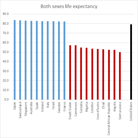
So, there you go. The top 10 countries in terms of life expectancy are two wealthy Asian countries and eight European countries. The bottom 10 are all poor African countries, most of which are either in a state of war or have just emerged from a prolonged state of war.
At first glance, it seems obvious: if you spend more, your people live longer. If you spend less, your people die sooner–as much as 30 years sooner for the lowest ranked countries. On the other hand, it’s not so easy to prove that it’s the higher spending that actually causes better health outcomes. And the anomalies highlight that logical disconnect. For example, the United States ranks 31st in life expectancy despite spending over twice as much per person as number one Japan ($9,237 per person VS $3,816.) And for that matter, the US spends over five times as much as Chile ($9,327 VS $1,780), which comes in three spots higher in life expectancy than the US at number 28. Not only is that just wrong, but it defies the logic that connects money to healthcare outcomes.
Then there’s the fact that the 30-year discrepancy in life expectancy we’re seeing between the top and bottom countries may be a tad skewed. For example, war and famine tend to reduce a country’s per capita life expectancy regardless of healthcare. They also tend to be associated with poorer countries that have less to spend on healthcare. How much of their lowered life expectancy is the result of poor healthcare, and how much is the result of war and famine? And then there’s infant mortality.
Infant Mortality
If a country’s infant mortality rates are high, that can drastically skew its life expectancy chart. Think of it this way. If a country only has two citizens in it and one lives to 99 and the other dies at one, that works out to an average life expectancy of just 50 years per citizen–despite the fact that every adult lives to 99.
Not surprisingly, we see many of the same countries with high life expectancy also having low infant mortality.4 “CIA — The World Factbook: Infant Mortality Rate”. CIA (Accessed 6 May 2017.) http://www.cia.gov/library/publications/the-world-factbook/fields/2091.html And we see many of the same poor African countries in the bottom 10. Depressingly, the US does even worse in regard to infant mortality than for life expectancy, coming in at number 58 out of 175 countries in terms of infant mortality. Again, a terrible return for the dollars spent.
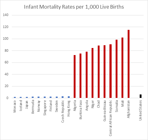
But keep in mind, you need to view these figures through a filter. War is particularly devastating to children in any given population, as they bear the brunt of the side effects. Is it any wonder then, that Afghanistan tops the charts at 115 deaths before the age of five per 1,000 children born as the Taliban are now advancing across the country, turning virtually the entire country into a war zone?
But let’s cut to the chase when it comes to infant mortality. Diarrhea and pneumonia — regarded as relatively minor illnesses in high-income countries — taken together are the leading causes of death for children worldwide. According to a paper published in the Lancet, pneumonia and diarrhea account for over a quarter of all deaths in children worldwide, responsible for around two million deaths in 2011.5 Walker CL, Rudan I, Liu L, Black RE, et al. “Global burden of childhood pneumonia and diarrhoea.” Lancet. 2013 Apr 20;381(9875):1405-16. http://www.ncbi.nlm.nih.gov/pubmed/23582727 Of those two million deaths, diarrhea accounted for about 700,000 in children under five, pneumonia for 1.3 million. Even more depressing is the fact that nearly 72 percent of the deaths from diarrhea and over 81 percent of the pneumonia deaths are in children under two years old.
The report also found that the highest burden for these diseases was concentrated in sub-Saharan Africa and Southeast Asia, with nearly 74 percent of deaths from diarrhea and pneumonia occurring in just fifteen countries located in those areas. While diarrhea and pneumonia have very different symptoms and causes, several risk factors for the two diseases are the same, including under-nutrition, sub-optimal breastfeeding, and zinc deficiency. And when it comes to diarrhea, healthcare dollars probably matter less than money spent on simple sanitation, training in proper hygiene, and clean water as rotavirus and cholera are primary causative factors, and both viruses spread in the feces of those who are infected.
Heart Disease
So far in our discussion, despite a few anomalies, it certainly looks like more money means better health, but let’s look at one other cause of death before moving on: heart disease.
The numbers are remarkably revealing. Overwhelmingly, deaths from heart disease are higher in wealthy countries that spend a great deal on healthcare than they are in poorer countries that spend little. The US leads high income countries at 445 deaths per thousand citizens, besting second place Germany by a margin of about three to one. But even Japan is over 100 deaths per thousand. But look at the poor countries in South America (El Salvador, Ecuador, and Guatemala). They all come in under five per thousand. And many of the poorest countries in Sub-Saharan Africa (Sierra Leone, Liberia, and Eritrea, for example.) come in below two! With the US spending over 200 times as much per capita, clearly, more money does not necessarily save you from dying from heart disease. Yes, drugs and surgery can keep you alive if you are diagnosed with it, but emergency pharmaceuticals and surgical intervention can’t hold a scalpel to the advantages of simply not getting heart disease in the first place. And here, the simplified, non-processed diet dictated by poverty is far superior to the expensive, fast food, pre-packaged, heavily process diet of the West. When it comes to heart disease, low cost lifestyle trumps expensive healthcare.
Now, in the interest of full disclosure, it should be noted that these statistics are skewed just a tad in favor of the poor countries. Heart disease tends to be a disease of old age–despite the fact that we are seeing it appear at ever earlier ages in the US. Nevertheless, if a notable percentage of a nation’s children are dying from diarrhea and pneumonia before age five, and if a notable percentage of your young and middle aged adults are dying as a result of war, they’re not going to be living long enough to add to your country’s heart disease statistics. In other words, their early deaths skew the data away from heart disease. But that said, the data bias introduced by early death doesn’t come close to accounting for the 200-fold disparity in deaths from heart disease between those countries and the US.
And speaking of the US, it should be noted that the US, which spends the most on healthcare, has the highest mortality rate from heart disease among all wealthy countries.
The Final Months
So, why does the US pay so much more than any other country for healthcare and receive so little benefit for it? Well, for one thing, the pharmaceutical companies have managed to lobby Congress to finagle the highest prices for their drugs in the world. U.S. prices for the world’s 20 top-selling medicines are, on average, three times higher than in Britain, six times higher than in Brazil, and 16 times higher than the average in the lowest-priced countries such as India.6 Ben Hirschler. “Exclusive – Transatlantic divide: how U.S. pays three times more for drugs.” Reuters. Oct 12, 2015. (Accessed 8 May 2017.) http://www.reuters.com/article/us-pharmaceuticals-usa-comparison-idUSKCN0S61KU20151012
And then there’s dying–which is far more expensive in the US than anywhere else in the world. Medicare, which is the health insurance program for the elderly, spends nearly 30 percent of its budget on beneficiaries in their final year of life, a proportion that has remained steady for decades.7 Gerald F. Riley and James D. Lubitz, “Long-Term Trends in Medicare Payments in the Last Year of Life.” Health Serv Res 2010;45 (2): 565-76; Christopher Hogan et al., “Medicare Beneficiaries’ Costs of Care In The Last Year of Life,” Health Serv Res. 2010 Apr; 45(2): 565–576. http://www.ncbi.nlm.nih.gov/pmc/articles/PMC2838161/ Even more dramatic, a little over half of Medicare dollars are spent on patients who die within two months. About 80 percent of the 2.6 million people who died in the US in 2014 were on Medicare, making Medicare the largest insurer of healthcare provided during the last year of life.8 Juliette Cubanski, Tricia Neuman, Shannon Griffin, and Anthony Damico, “Medicare Spending at the End of Life: A Snapshot of Beneficiaries Who Died in 2014 and the Cost of Their Care.” Kaiser Family Foundation, July 14, 2016. (Accessed 7 May 2017.) http://kff.org/medicare/issue-brief/medicare-spending-at-the-end-of-life/ In the end, this means that one percent of the population accounts for 30 percent of the nation’s healthcare expenditures.
But everything we’ve said so far is in the abstract. Let’s talk some real numbers. In 2008, Medicare paid out some $50 billion just for doctor and hospital bills—that’s more than the budget of the Department of Homeland Security ($41 billion in 20169 http://www.dhs.gov/sites/default/files/publications/FY_2016_DHS_Budget_in_Brief.pdf ) or the Department of Education ($15 billion in 201610 http://www2.ed.gov/about/overview/budget/history/edhistory.pdf ).
And it’s been estimated that 20 to 30 percent of these medical expenditures during the last months of life have neither extended nor enhanced the quality of life in months. How can this happen? Well, most of the bills are paid for by the federal government with no questions asked. According Dr. Ira Byock, who was interviewed in a 60 Minutes segment hosted by Steve Kroft, “Something like 18 to 20 percent of Americans spend their last days in an ICU. And, you know, it’s extremely expensive. It’s uncomfortable. Many times they have to be sedated so that they don’t reflexively pull out a tube, or sometimes their hands are restrained. This is not the way most people would want to spend their last days of life. And yet this has become almost the medical last rites for people as they die.” Dr. Byock also told Kroft that it costs up to $10,000 a day to maintain someone in the intensive care unit. Some patients remain here for weeks or even months.
Now, the last major analysis by The Health Care Financing Administration (HCFA), which oversees Medicare spending, was conducted in1993. However, although Medicare costs for services have continued to rise over the years, the proportion of payments for persons near death in relation to Medicare’s total budget has changed little over the last 50 years. In other words, the findings from the 1993 analysis are still considered to be valid. And that analysis found that:
- Nearly one third of terminally ill patients with insurance used up most or all of their savings to cover uninsured medical expenses such as home care.
- 27 to 30 percent of Medicare payments cover the cost of care for people in the last year of life.
- 40 percent of Medicare dollars cover care for people in the last month.
- 12 percent of Medicare spending covers people who are in the last two months.
- 10 percent of Medicare beneficiaries account for 70 percent of program spending.
Sometimes hospice care really is the best choice—not because it’s hugely cheaper than intensive care, which it is—but simply because, for terminal patients, care designed to support them in the final phase of a terminal illness and focus on their comfort and quality of life, rather than lying semi-comatose in an IC bed for the final weeks of life, is simply a far-and-away better option. Sometimes the goal really should be to enable patients to be comfortable and free of pain, so that they live each day as fully as possible, if that’s what they want.
The Other Half of the Problem

But Medicare and near death expenses are only half the problem for the US. As the US moves further away from treating healthcare as a basic human right provided by the government, it moves closer to treating it as a for-profit product provided by insurance companies, employers, hospitals, and doctors. And that leads to three problems:
- As a product, it means that providers have a motivation to cut costs. Thus, the penchant for insurance companies to deny coverage for a multitude of reasons. If you were worried about death panels under ACA, you should be terrified by your prospects under a for-profit, product model.
- As a product, it means that providers look to increase profits. Thus, in addition to cost cutting, you can expect to see yearly increases in your premiums that go well beyond inflation.
- And by transferring the burden of healthcare costs for the majority of the country’s population to employers, it makes those employers uncompetitive with most other countries around the world.
The net result, as Warren Buffet pointed out at the recent Berkshire Hathaway annual “Woodstock for Capitalists” meeting, is that healthcare costs in the US, as a percent of GDP have skyrocketed, significantly diverging with those of other industrial countries. Our healthcare costs stand at 17.1 percent of GDP, up from 13.1 percent in 1995. The figure in Germany is only 11.3 percent, up from 9.4 percent during the same period. Japan’s is 10.2 percent, up from 6.6 percent. Britain’s healthcare costs are 9.1 percent of GDP, up from 6.7 percent in 1995. And China’s is only at 5.5 percent, up from 3.5 percent.
That puts the United States at a material disadvantage far beyond the tax differential. And it harms American companies in particular, since they bear such a big share of those costs. On average, corporations spend $12,591 for coverage of a family of four, up 54 percent since 2005, according to a study by the Kaiser Family Foundation.11 “2015 Employer Health Benefits Survey.” KFF.org. Sep 22, 2015. (Accessed 9 May 2017.) http://kff.org/report-section/ehbs-2015-summary-of-findings/
To quote Mr. Buffet, “Medical costs are the tapeworm of American economic competitiveness.”
Conclusion
When it comes to healthcare, money matters, but not as much as we might have believed before looking at the facts. Yes, you have to spend money for healthcare, but how you spend the money matters more than how much you spend. Given that, the news is both good and bad going forward.
The disparity between the haves and have nots is not likely to get any better in the coming decades. On the other hand, with the exception of the very poorest countries, the movement toward universal healthcare and better health outcomes appears to have broad momentum throughout the world. Outside of the US, healthcare is being viewed ever more as a basic human right, not a product. As the same time as the US appears to be backtracking on universal coverage, middle income countries like Thailand,12 “Thailand: healthcare for all, at a price.” Bulletin of the WHO. Volume 88: 2010 Volume 88, Number 2, February 2010, 81-160. http://www.who.int/bulletin/volumes/88/2/10-010210/en/ Mexico,13 “Mexico achieves universal health coverage, enrolls 52.6 million people in less than a decade.” Harvard TH Chan School of Public Health. http://www.hsph.harvard.edu/news/features/mexico-universal-health/ and Vietnam14 “Mexico achieves universal health coverage, enrolls 52.6 million people in less than a decade.” Harvard TH Chan School of Public Health. http://www.hsph.harvard.edu/news/features/mexico-universal-health/ are moving towards it. Even more interesting, although Vietnam only spends about $400 a person on healthcare, that healthcare is universal with an emphasis on prevention, which is far more cost effective than treatment.15 Tsung-Mei Cheng “Vietnam’s Health Care System Emphasizes Prevention And Pursues Universal Coverage.” Health Aff November 2014 vol. 33 no. 11 2057-2063. http://content.healthaffairs.org/content/33/11/2057.abstract
The bottom line is that the US doesn’t have the best healthcare system in the world, despite claims to the contrary from politicians in both parties. What we have is the most expensive care, which is not the same thing. Yes, if you are wealthy, you can buy incredible care in the US–or freely travel abroad for cutting edge treatments that aren’t allowed in the US. And yes, if you have a Cadillac health plan, then you can get great healthcare–just not access to the most cutting edge treatments. But if you have an average health plan, you might find your treatment coming up short–with many services and treatments denied to you by your insurance company. And if you’re one of the millions without any insurance–and that number looks likely to grow hugely–you might want to consider moving to Mexico.
Just kidding. In fact, what you want to do is start moving towards a comprehensive, self-administered, Baseline of Health® style program focused on disease prevention.
References
| ↑1 | Dieleman, Joseph et al. “Evolution and patterns of global health financing 1995–2014: development assistance for health, and government, prepaid private, and out-of-pocket health spending in 184 countries.” The Lancet, 19 April 2017. http://www.thelancet.com/journals/lancet/article/PIIS0140-6736(17)30874-7/fulltext |
|---|---|
| ↑2 | Dieleman, Joseph L et al. “Future and potential spending on health 2015–40: development assistance for health, and government, prepaid private, and out-of-pocket health spending in 184 countries.” The Lancet, 19 April 2017. http://www.thelancet.com/journals/lancet/article/PIIS0140-6736(17)30873-5/fulltext |
| ↑3 | “World Health Statistics 2016: Monitoring health for the SDGs Annex B: tables of health statistics by country, WHO region and globally.” World Health Organization. 2016. (Accessed 6 May 2017). http://www.who.int/gho/publications/world_health_statistics/2016/EN_WHS2016_AnnexB.pdf |
| ↑4 | “CIA — The World Factbook: Infant Mortality Rate”. CIA (Accessed 6 May 2017.) http://www.cia.gov/library/publications/the-world-factbook/fields/2091.html |
| ↑5 | Walker CL, Rudan I, Liu L, Black RE, et al. “Global burden of childhood pneumonia and diarrhoea.” Lancet. 2013 Apr 20;381(9875):1405-16. http://www.ncbi.nlm.nih.gov/pubmed/23582727 |
| ↑6 | Ben Hirschler. “Exclusive – Transatlantic divide: how U.S. pays three times more for drugs.” Reuters. Oct 12, 2015. (Accessed 8 May 2017.) http://www.reuters.com/article/us-pharmaceuticals-usa-comparison-idUSKCN0S61KU20151012 |
| ↑7 | Gerald F. Riley and James D. Lubitz, “Long-Term Trends in Medicare Payments in the Last Year of Life.” Health Serv Res 2010;45 (2): 565-76; Christopher Hogan et al., “Medicare Beneficiaries’ Costs of Care In The Last Year of Life,” Health Serv Res. 2010 Apr; 45(2): 565–576. http://www.ncbi.nlm.nih.gov/pmc/articles/PMC2838161/ |
| ↑8 | Juliette Cubanski, Tricia Neuman, Shannon Griffin, and Anthony Damico, “Medicare Spending at the End of Life: A Snapshot of Beneficiaries Who Died in 2014 and the Cost of Their Care.” Kaiser Family Foundation, July 14, 2016. (Accessed 7 May 2017.) http://kff.org/medicare/issue-brief/medicare-spending-at-the-end-of-life/ |
| ↑9 | http://www.dhs.gov/sites/default/files/publications/FY_2016_DHS_Budget_in_Brief.pdf |
| ↑10 | http://www2.ed.gov/about/overview/budget/history/edhistory.pdf |
| ↑11 | “2015 Employer Health Benefits Survey.” KFF.org. Sep 22, 2015. (Accessed 9 May 2017.) http://kff.org/report-section/ehbs-2015-summary-of-findings/ |
| ↑12 | “Thailand: healthcare for all, at a price.” Bulletin of the WHO. Volume 88: 2010 Volume 88, Number 2, February 2010, 81-160. http://www.who.int/bulletin/volumes/88/2/10-010210/en/ |
| ↑13, ↑14 | “Mexico achieves universal health coverage, enrolls 52.6 million people in less than a decade.” Harvard TH Chan School of Public Health. http://www.hsph.harvard.edu/news/features/mexico-universal-health/ |
| ↑15 | Tsung-Mei Cheng “Vietnam’s Health Care System Emphasizes Prevention And Pursues Universal Coverage.” Health Aff November 2014 vol. 33 no. 11 2057-2063. http://content.healthaffairs.org/content/33/11/2057.abstract |


So, if one adjusts for infant
So, if one adjusts for infant mortality then those “poorer” countries are not that far off the wealthier countries. Is that so?
My wife and I use MMS
My wife and I use MMS (protocol 1000 every 3-4 months) and SMS (a teaspoon daily) as prevention and we eat mostly industrial processed food because we still are very busy at 73.
We both feel very good and young.
This is a fantastic article.
This is a fantastic article. I would love to see it published on major news channels. I find it very disturbing how many people think a business man is going to fix their problems. This is especially true when it comes to health care.
Just because someone is plain speaking, or as I heard someone refer to our current leader as the loud mouth at the end of the bar, does not mean they represent you, or represent your interests.
I am dumbfounded as to how to address the misconception that the Trump care plan is going to be better for the low or middle class. I have come to the conclusion that these folks have never read either plan o make a comparison but are rather just listening to the pundits, or Fox News.
A very good article on public
A very good article on public health cost and relationship to economic wealth. Can we take a flip side view? Health costs would be inversely related to the health of the nation if affordability was not an issue meaning if you are healthy you have a lower health cost and therefore using fewer medications and health facilities. What if we looked at factors that improve health outcomes and how much is spent in money and or time. How much is spent on exercise, alternative therapy, fresh produce or the opposite nasty fast food, sun, govt policy/negligence/ corruption, vitamins, etc so that we can get a possible positive picture of what the top countries are doing or not doing to wreck their health. There must be other measurements perhaps not thought of as yet.
Thanks for the invaluable
Thanks for the invaluable information!
I like this great article.
I like this great article.
I will love to have some fun.
I will love to have some fun.
I love to read it all and
I love to read it all and will like to say that should share more such kind of information with readers.
It is really very nice stuff
It is really very nice stuff which the admin has shared with readers.
I really like the stuff which
I really like the stuff which had shared here.
I really like this article
I really like this article and appreciate it on this nice sharing.
I really like the shared
I really like the shared stuff about the cost vs benefit which readers will also like.